
Operación Éxito · Corporate identity
Corporate identity and brand guidelines for the most widely used learning platform in Puerto Rican schools: brand, stationery, merchandise, fleet, sub-brands, campaigns, print, web and gamification.
The challenge
Operación Éxito (OE) is Casa Grande Interactive’s learning platform for Puerto Rican schools: online classes and exercises, tutoring, analytics for teachers and the island’s academic competitions. It had grown fast and in many directions: every new product had its own logo, every campaign its own style and every supplier its own version of the brand.
It needed a system that brought everything under one brand. One that worked in a classroom, at a trade-show stand, on a van and on a screen, and that any printer, agency or in-house team could follow.
The solution
We developed the complete identity and documented it in a 64-page brand guidelines manual, “Rules and usage”. The work was done together with Circo: PuntoArg’s leads were Lucas Cabrera and Gonzalo Márquez, with creative direction by Carlos Maiolatesi.
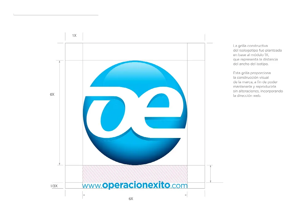
The brand. A circular logo with the letters “oe” in white on a dimensional blue sphere. It is built on a 6 × 6 modular grid whose 1X unit is the width of the symbol. There is a version with the web address underneath, at 1/3X, and defined clear-space areas.
Color. Two inks: Pantone Process Cyan C and Pantone 541 C, in CMYK C100 and C100 M60 K30. The manual defines:
the full-color version on white;
the version on the institutional gradient;
single-ink versions, on white and on solid color;
the black version and the white reversed version.
Corporate stationery, with print reproduction specs:
A4 letterhead, 120 gsm, offset;
a 25 × 34 cm catalog envelope and a 23.5 × 12 cm business envelope, both 180 gsm;
8.5 × 5 cm business cards on 350 gsm, printed front and back;
an 11 × 16 cm notepad.
Merchandise and fleet: pins, visors, pens, mugs, T-shirts in four colors and flags. Also the wraps for the utility vans, with the symbol at large scale on the side.
Sub-brands. Eleven product and program logos organized into a single family: Tutorías en línea, OE Club, Competencias, Padres, Hacia la Máxima · La Magna, Uno a Uno, Escuela OE, Prepárate, Time Out, OE Analítico and Science Bits.
Campaigns. The launch of the new website, with the concept “Education evolves, so does Operación Éxito”, was applied to:
a double-page ad;
a trade-show stand;
a roll-up, a mousepad and a T-shirt.
The institutional campaign, “A new way to teach, study and learn”, was applied to a four-panel brochure and flyers.
Print. The 2014 institutional catalog tells the platform’s story through student and teacher testimonials and its impact figures. The four-panel brochure for the Tratamiento Intensivo project explains its goals, activities and social impact.
Interactive:
design of the new website and its banners for each product;
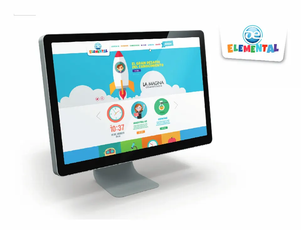
the OE Elemental site, for the primary grades;
the OE Elemental gamification: nine characters, one per subject (Health, Science, Finance, History, Math, Spanish, College Board, Art and English), and 39 achievement badges inspired by each subject, from the abacus and Sputnik to Don Quixote’s windmill and the Little Prince’s rose.
Results
Operación Éxito now speaks with one visual voice in schools, at trade shows, on the street and on screen. Every new product joins the sub-brand family without losing its link to the parent brand. The manual became the reference for printers, agencies and the in-house team.
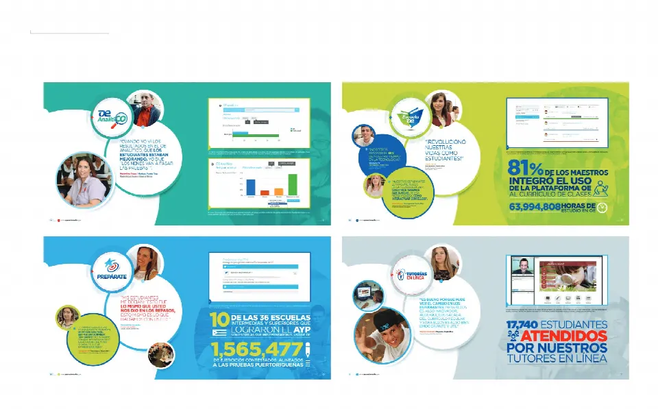
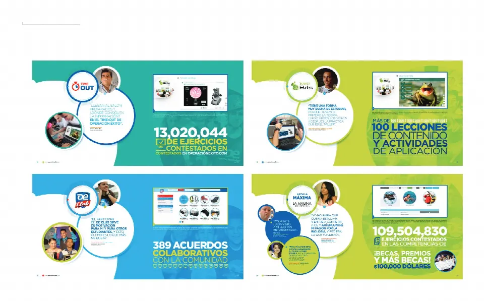
The 2014 institutional catalog we designed communicated the platform’s reach:
81% of teachers integrated OE into their curriculum;
63,994,808 hours of study;
13,020,044 exercises answered on operacionexito.com and 109,504,830 in the competitions;
17,740 students served by online tutors;
389 collaboration agreements with the community;
US$100,000 in scholarships and prizes.
A sphere, two letters and two inks: the brand is built on a modular grid so it always reproduces the same way.
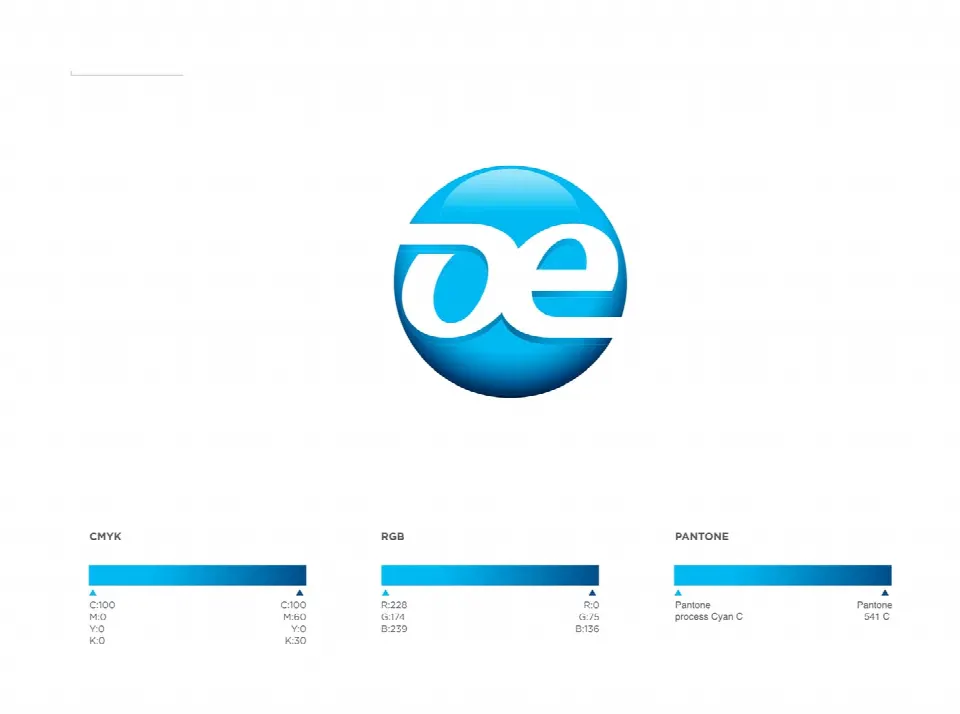

Full CMYK version on white and on the institutional gradient: Pantone Process Cyan C and 541 C.

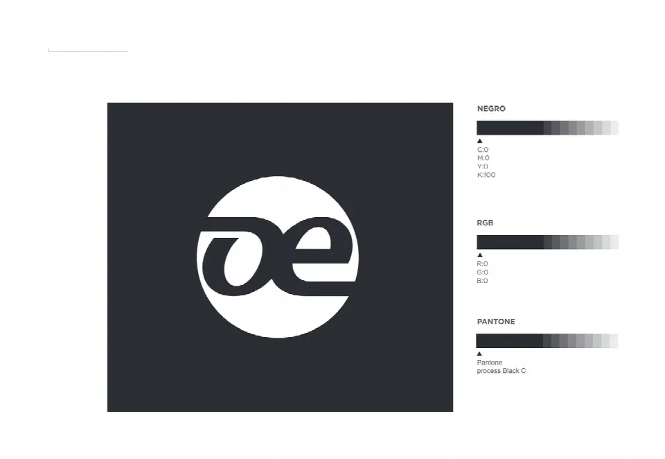
Solid black version and white reversed version.
Corporate stationery with print reproduction specs.
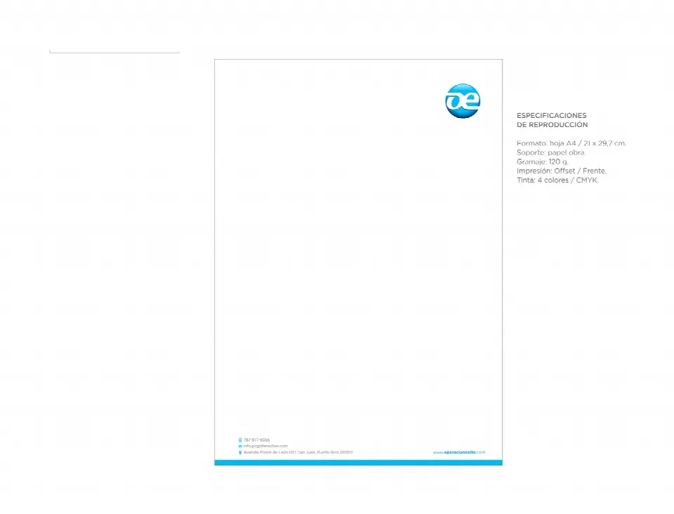

A4 letterhead on 120 gsm and 8.5 × 5 cm business cards on 350 gsm, front and back.

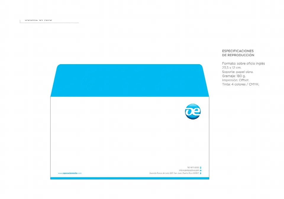
25 × 34 cm catalog envelope and 23.5 × 12 cm business envelope, on 180 gsm.
The brand off screen: merchandise, apparel, flags and fleet.


Pins and pens in the brand’s two inks.
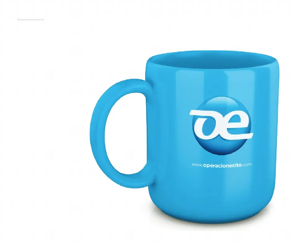
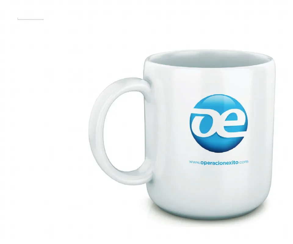
Mugs in cyan and white.
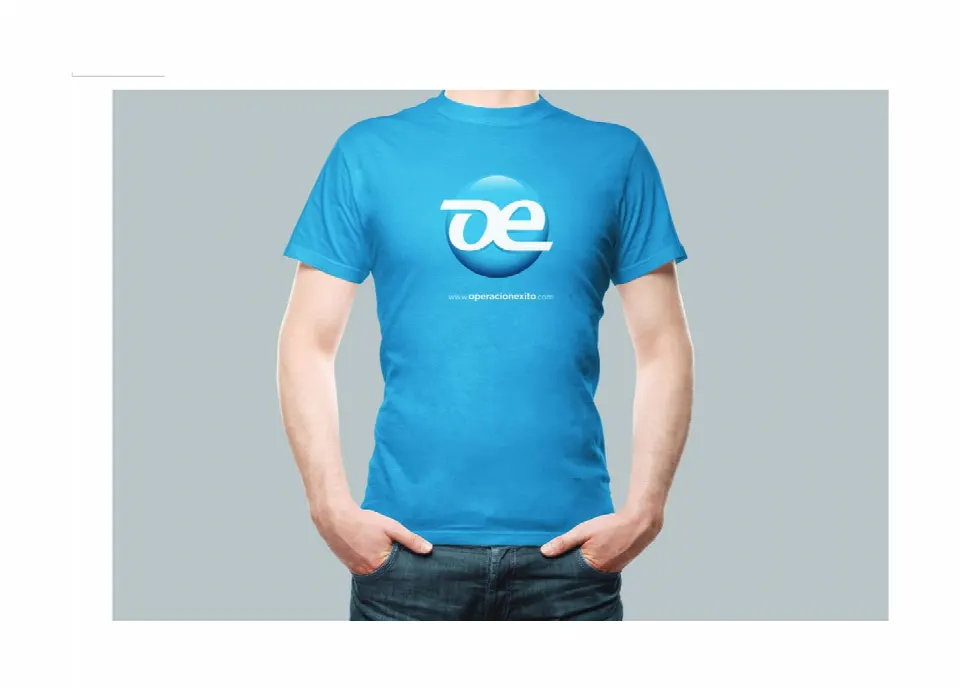
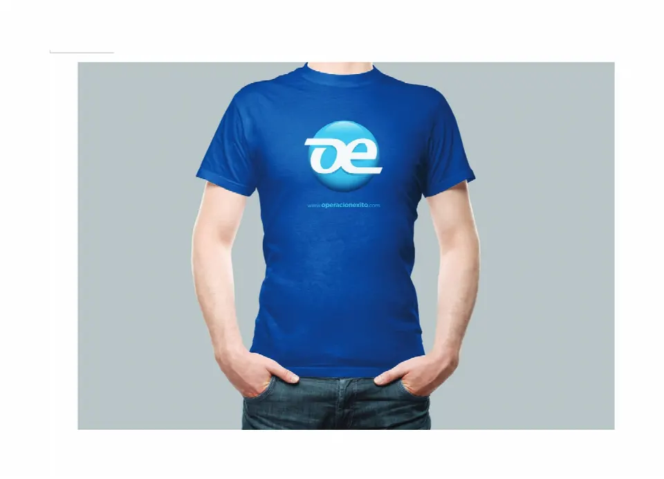
T-shirts: the symbol on the chest with the web address.
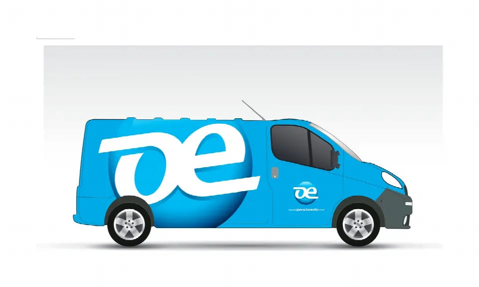
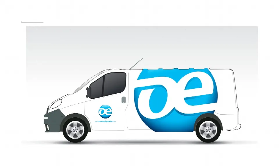
Utility van wraps: the symbol at large scale on the side.
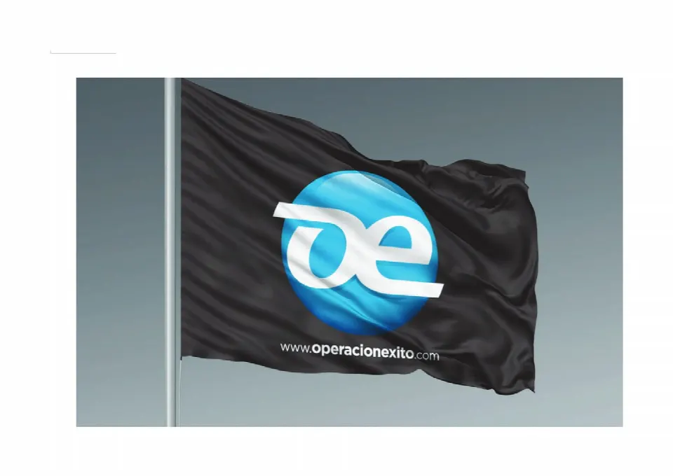
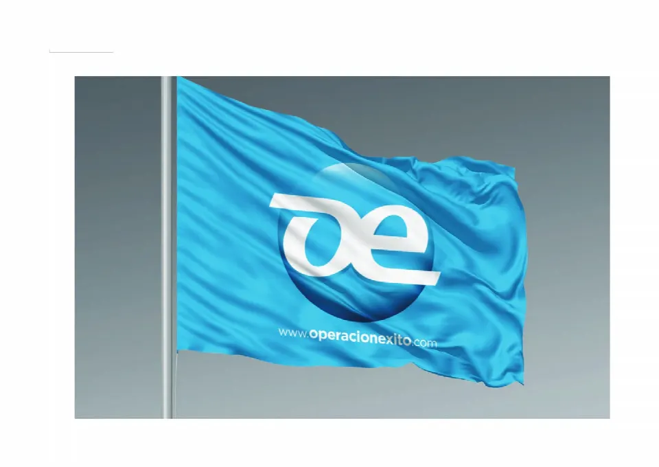
Institutional flags.
Eleven products and programs, one family.
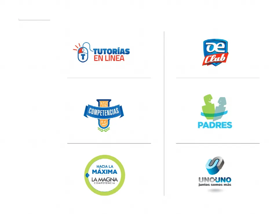
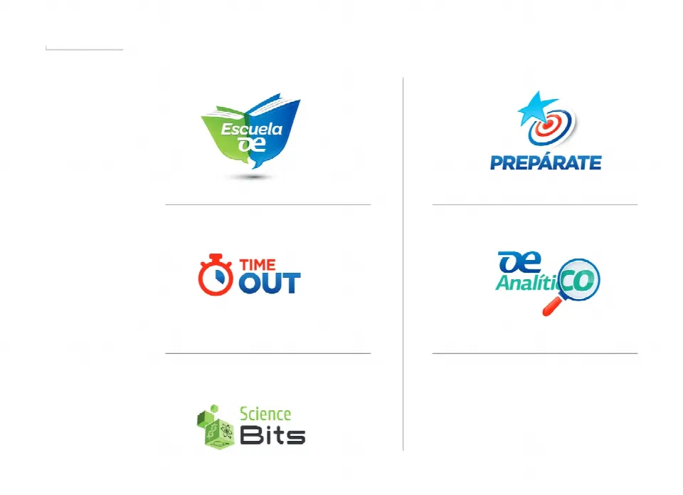
Tutorías en línea, OE Club, Competencias, Padres, Hacia la Máxima · La Magna, Uno a Uno, Escuela OE, Prepárate, Time Out, OE Analítico and Science Bits.
“Education evolves, so does Operación Éxito”: the launch campaign for the new website.
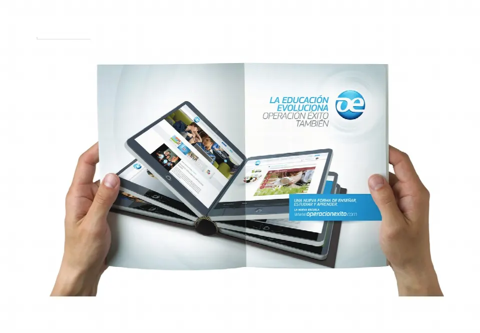
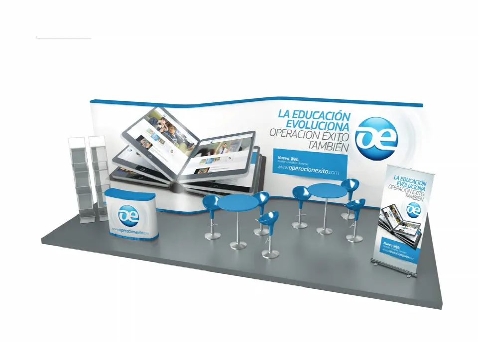
Double-page ad and trade-show stand.


Campaign mousepad and roll-up.


Flyers for the institutional campaign “A new way to teach, study and learn”.

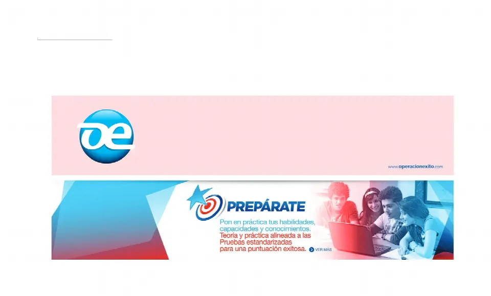
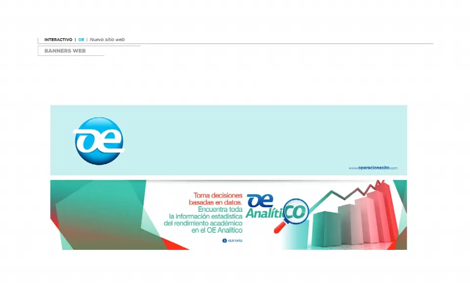
Web banners for each product: Prepárate and OE Analítico.
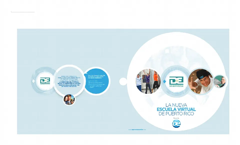
The 2014 institutional catalog tells the platform’s story through the voices of students and teachers, and through its numbers.
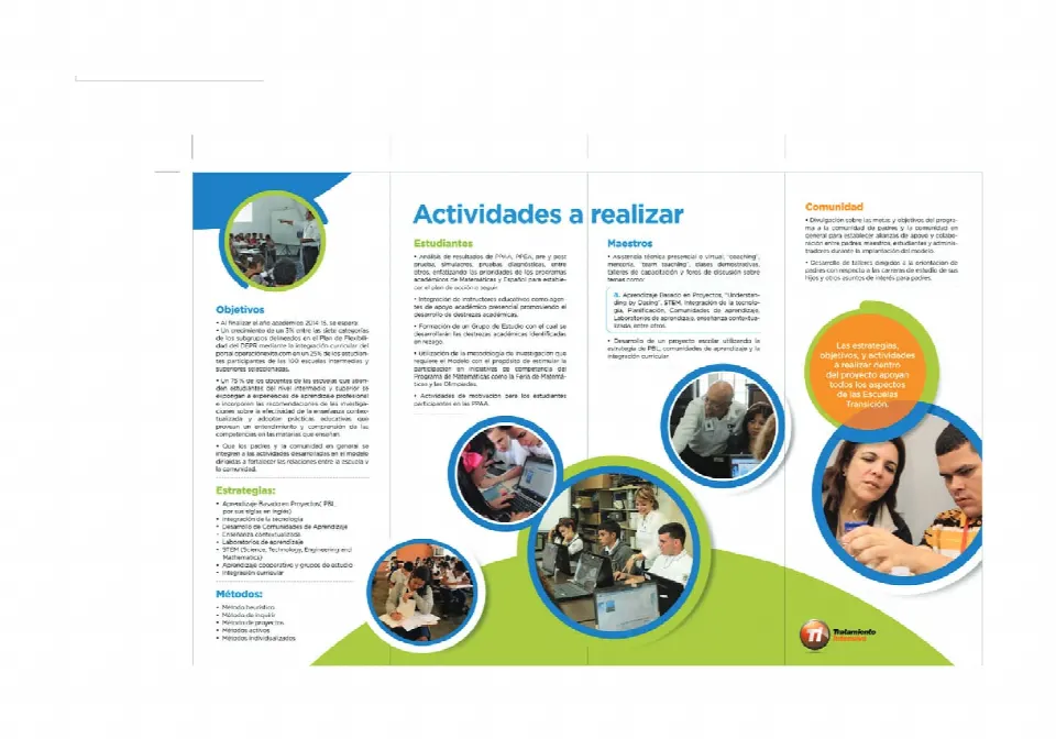
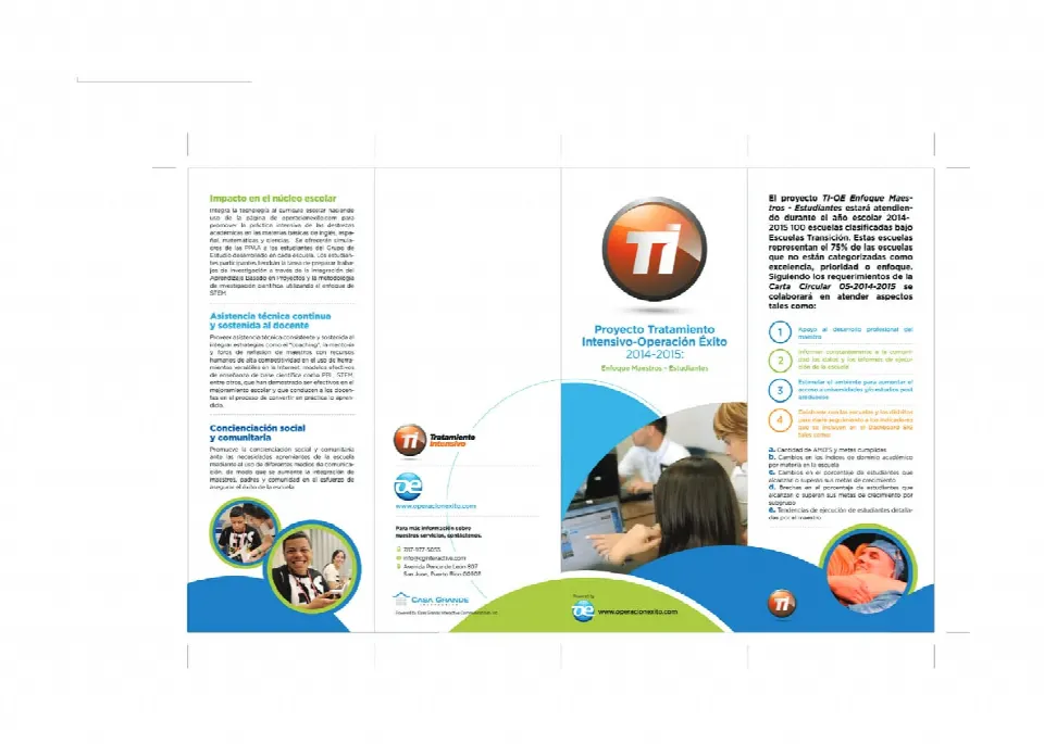
Four-panel brochure for the Tratamiento Intensivo project: goals, activities and social impact.
OE Elemental: the platform for younger students, with characters and achievements for learning through play.
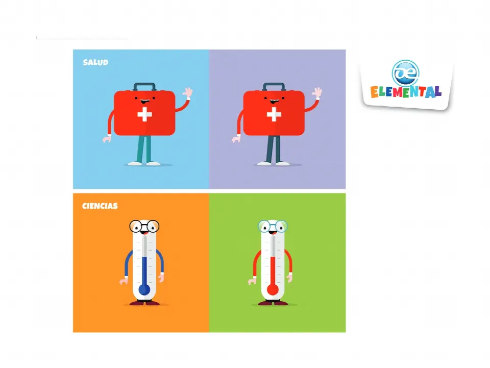
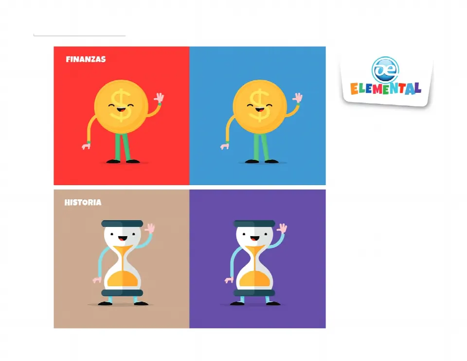
Health, Science, Finance and History characters.
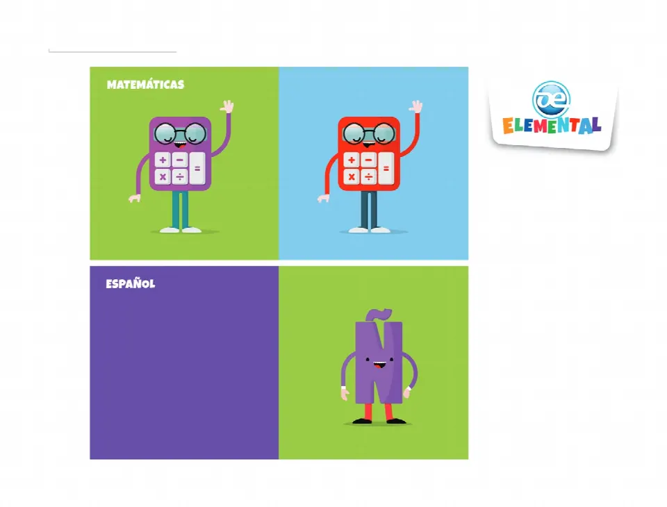
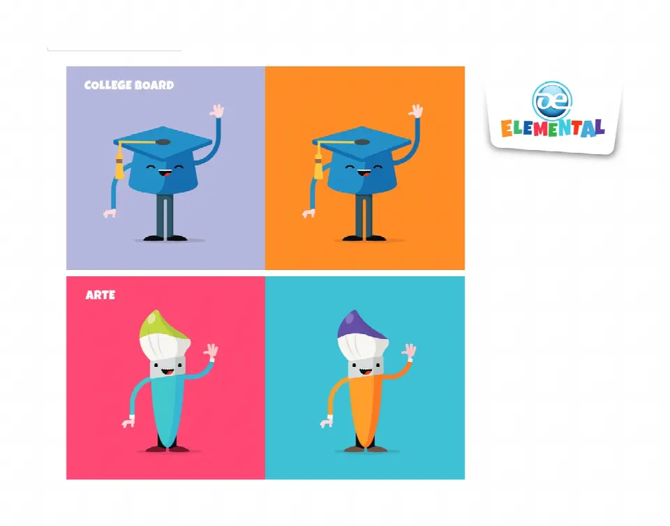
Math, Spanish, College Board and Art characters.
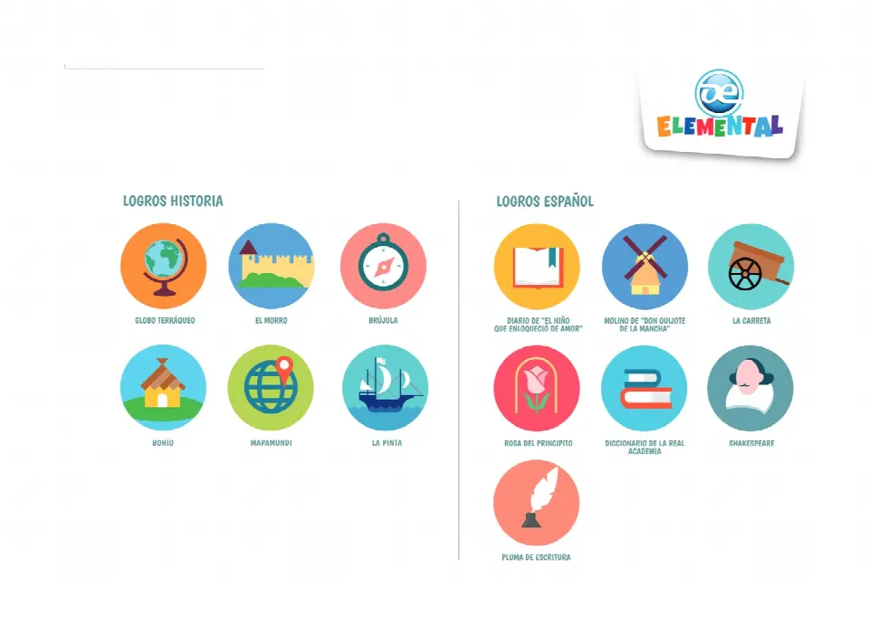
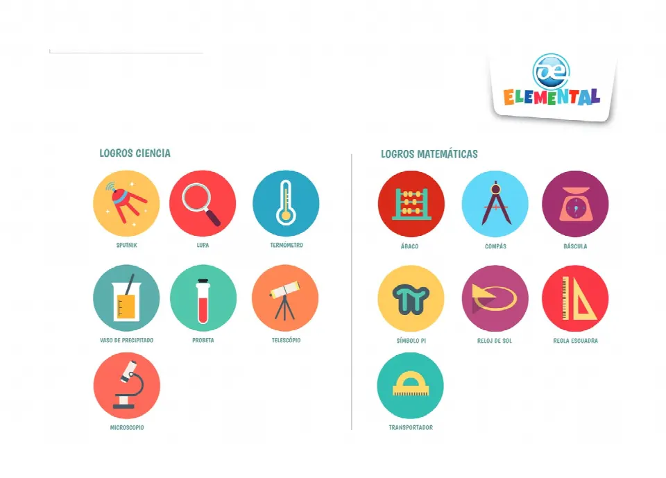
Achievement badges for History, Spanish, Science and Math: from the globe and El Morro to the abacus and Sputnik.