Mobile first: why we design for the phone first
01 de September, 2026 · Design
Your customers look for you on their phones and Google indexes your site from its mobile version. What designing mobile first means and which mistakes to avoid.
Think of the last time you looked up a business, opening hours or a price. You almost certainly did it on your phone, on the street or on the couch, with one hand. That’s how your customers look for you too. Argentina had over 40 million internet users at the start of 2024, almost 90% of the population, and much of that use happens on the phone.
Google looks at the phone first too
For years Google has used the mobile version of your site to index and rank it (it calls this mobile-first indexing). If on the phone your site hides content, loads slowly or is hard to use, that’s what Google sees, even if it looks perfect on a computer.
What designing mobile first means
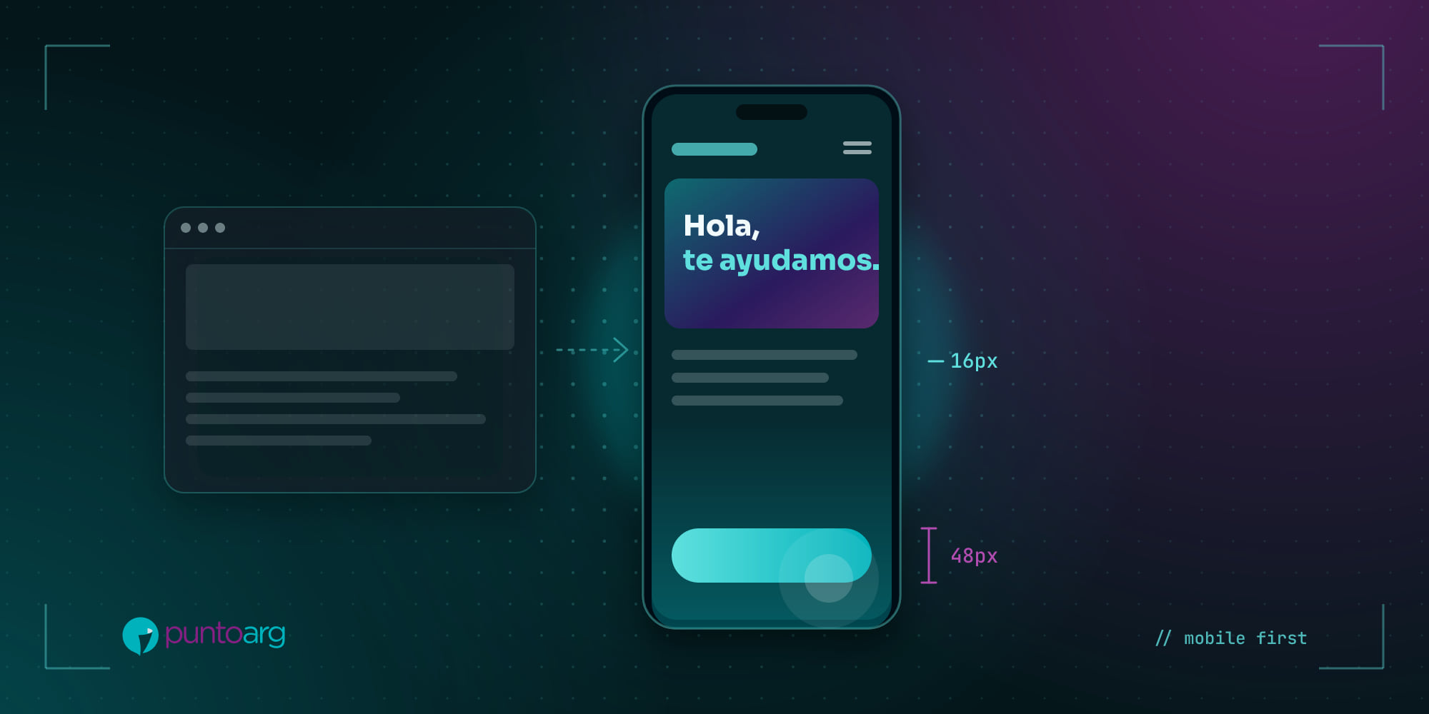
It isn’t “shrinking” a desktop design. It’s the other way around: start with the smallest screen, decide what’s essential and then use the extra space on larger screens. That constraint forces you to prioritize, and prioritizing improves the site at every size.
In practice, it means asking on every screen: what has this person come to do, and how do they do it with their thumb?
Principles we apply
- One goal per screen. Call, request a quote, buy, book. The main button must be visible and within thumb reach.
- Big buttons. Touch targets should be at least around 44 to 48 pixels, with space between them so you don’t hit the wrong one.
- Text readable without zooming. Body text of at least 16 pixels and good contrast with the background.
- Short forms. Ask only for what you need, use the right keyboard (numeric for phone numbers, email for emails) and take advantage of autofill.
- Shortcuts the phone knows how to do: tap to call, open WhatsApp, see the location on a map.
- Light weight. Optimized images and no heavy autoplaying videos on mobile data.
Mistakes we see often
- Pop-ups that cover everything as soon as you arrive, with a tiny close button.
- Menus with twenty options that become an endless list on the phone.
- Tables and text that overflow the screen and force sideways scrolling.
- Key information inside images (prices, hours) that can’t be copied, is hard to read and Google doesn’t understand.
- Testing only on a computer with a shrunk browser window instead of on a real phone.
How to tell if your site works on the phone
Try this: grab your phone, open your site on mobile data (not the office wifi) and try to do what a customer would: find a product, check a price, contact you. Time how long it takes and note every time you had to zoom or tapped something by accident. That’s your starting point.
At PuntoArg every project is designed mobile first and tested on real devices before launch. If you want us to review your site, write to us.
Sources
- DataReportal, Digital 2024: Argentina.
- Google Search Central, Mobile-first indexing best practices.