Ticket Boss
Brand and landing page for a ticketing platform with no service fee, made together with Berta: from the “B” symbol to the page that explains how to sell.
The challenge
Ticket Boss is a platform for selling tickets online, built for electronic music producers and parties. Its offer breaks with the usual: it charges no service fee to the public, just a fixed cost per ticket paid by the producer.
In an industry where everything is ephemeral, it needed a solid identity that looks and feels like the night, and a page that explains a different model in seconds: how much it costs, how you get paid and what it takes to get started.
The solution
Berta and PuntoArg, as one team. We worked on the brand and the website together, from the first idea to the last detail.
The brand. The identity is born from the initial: a “B” distilled into a simple, continuous stroke that works on its own as an icon and next to the name as a logo. It comes with:
- a palette of aqua green, deep blue and dark blue: the anticipation of going out, the trust of buying and the night where everything happens;
- Surgena for the logo and Arimo as the everyday typeface;
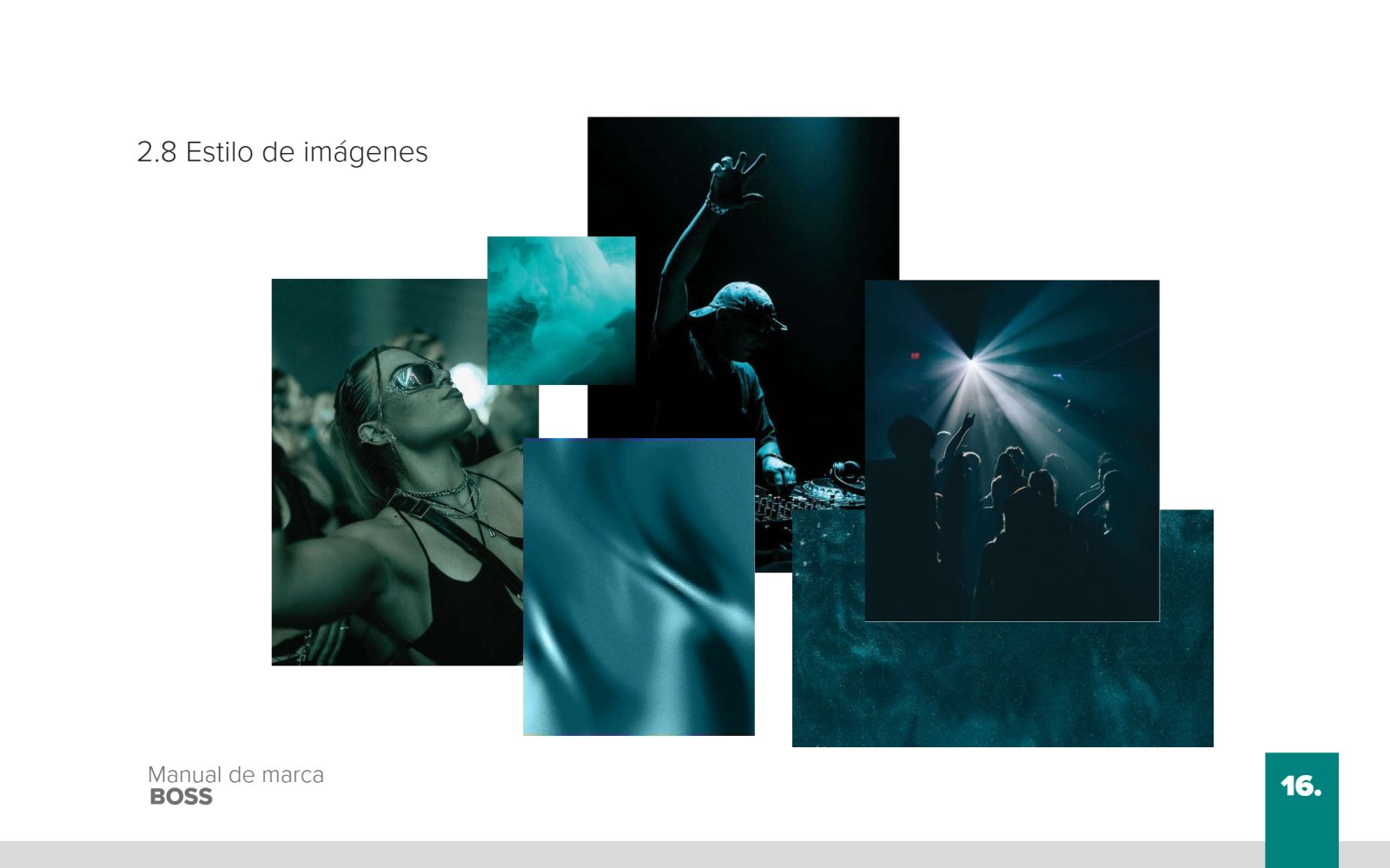
- a pattern made from the symbol and a photo style of dance floors, lights and people dancing, tinted aqua;
- a 24-page brand manual with construction grid, clear space, variants, reductions and incorrect uses.
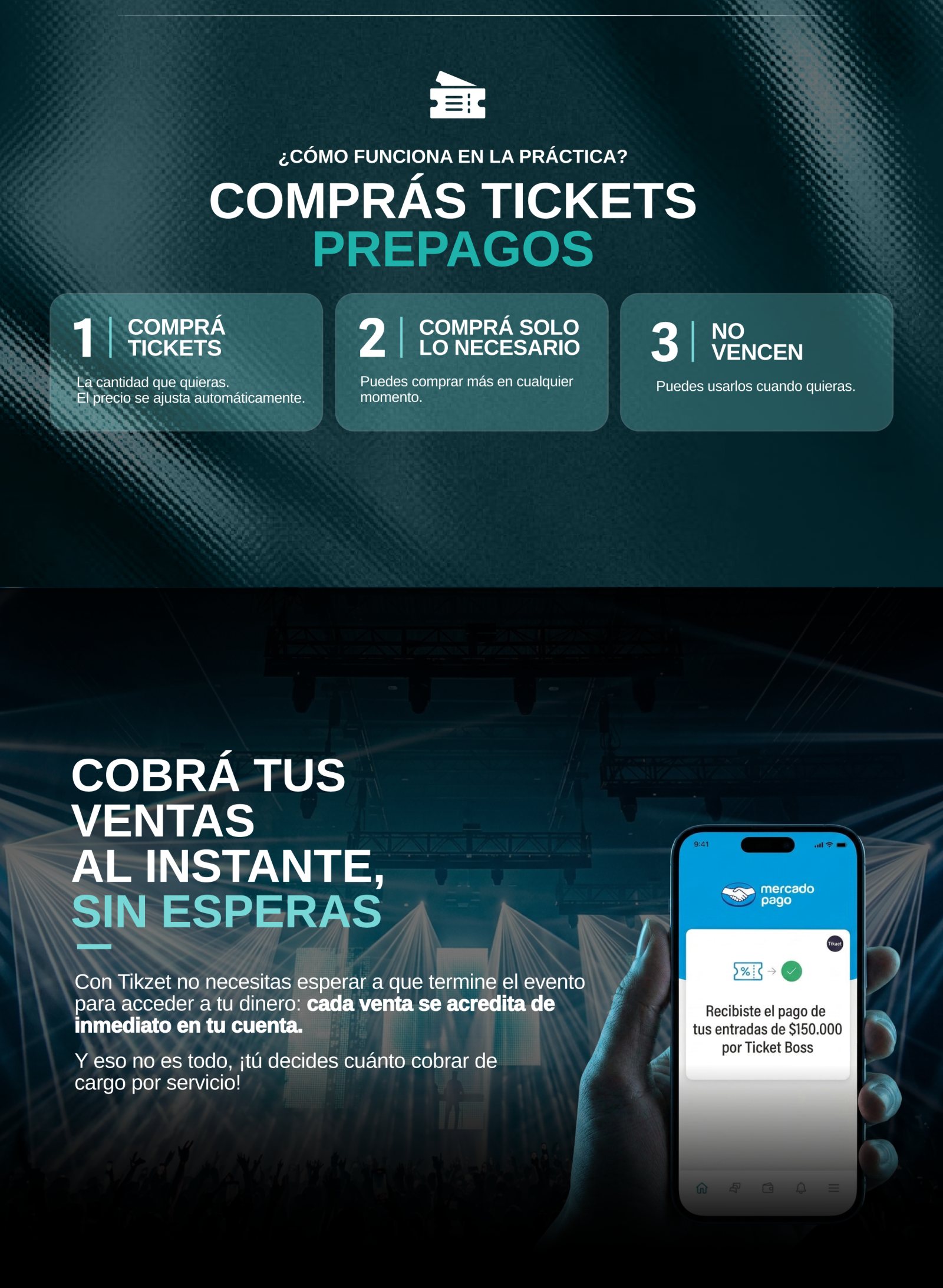
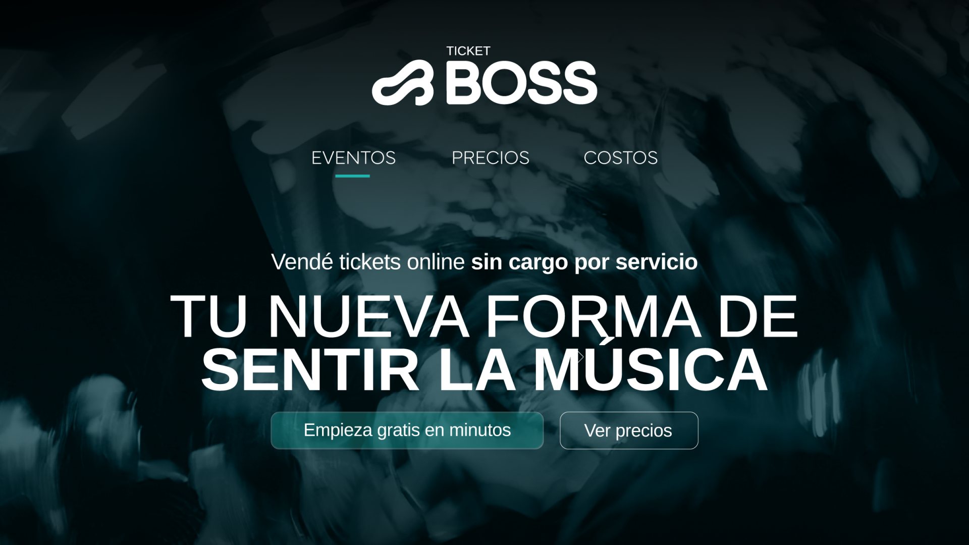
The landing page. It takes the brand to a page that sells the platform: “A new way to feel the music”. It explains the model step by step:
- how much it costs, with a welcome offer of 25 free tickets;
- prepaid tickets, bought as needed, that never expire;
- instant payouts through Mercado Pago, with a service fee each producer decides;
- four steps with no contract or advance notice: sign up and publish, sell with a link, validate tickets with a phone and check the reports;
- upcoming events and a footer with community, Boss Swap, support and newsletter.
Results
Ticket Boss launches with its own recognizable brand, ready to grow on social media, in the app and at every event, and with a page that turns a new model into something easy to understand. An identity you don’t just see: you feel it on the dance floor.
“BOSS isn’t just a brand: it’s an identity you live.”


The brand manual and the logo: the “B” as one continuous stroke, next to the name.
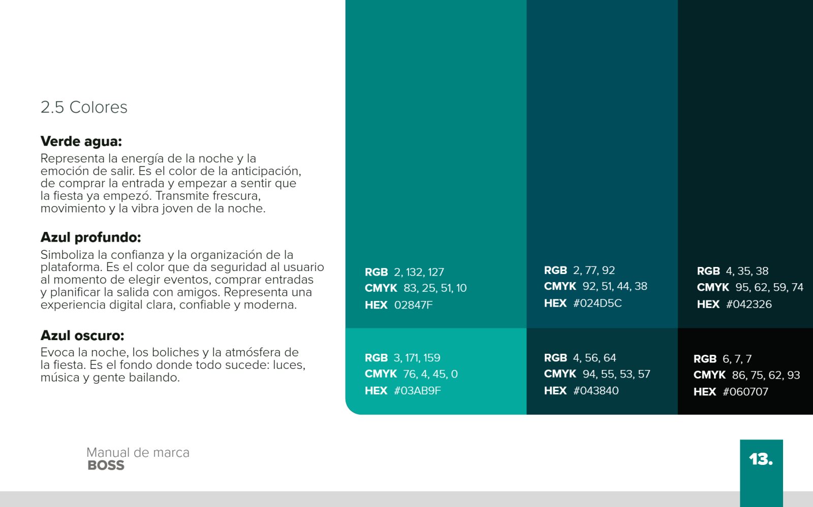

Aqua green, deep blue and dark blue; Surgena for the logo and Arimo for everyday use.
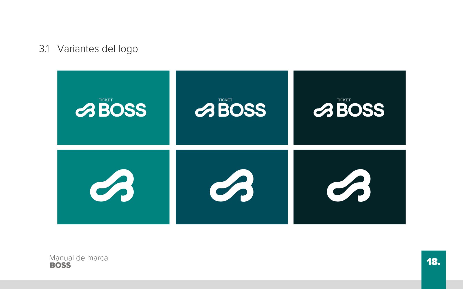

Logo variants on the brand colors and the pattern made from the symbol.
From the brand to the page that sells the platform.